Food Find
Food Find
Role: Solo student project for General Assembly UX Design Bootcamp
Tools: Figma, Miro
Timeline: June 2023 - Oct 2023
Original assignment was submitted in Aug for the class, but I continued to work on it after the fact.
“Gen Z feels pressure, anxiety and insecurity about their food choices…two-thirds of Gen Z consumers believe their eating pattern is wrong.”
Problem
Busy lives and higher food prices make food shopping and prepping more overwhelming for the Gen Z and Millennial demographics
Goal
Provide users with a simplified process to better meal plan with less hassle
Business Opportunities
What we offer users:
Customizable shopping experience through preference
Ability to browse and shop by recipes
Photo search engine, connected through Google, providing shoppers to corresponding recipes
So how do we get there?
User Research and Insights
Off the bat I knew I wanted the target audience to be older gen z and young millennials. A demographic that can no longer inherit the American Dream promised to them by their predecessors. They are struggling with their relationship with food buying while dealing with busy schedules and facing financial insecurity. 54% of Gen Z’s food comes from ordering out, which is the first time in four generations where majority meal consumption does not come from self preparation. With that in mind, it makes it no surprise that 78% spend most of their disposable income on food
Interview
I conducted 5 user interviews from participants ranged in their early to late 20s. These participants were:
Full time college students
Full time workers
People who were working part time and going to school part time
Research Questions
I wanted to know how much financial restrictions determined how often they bought food and also what type of food would be bought.
I also sought out to find out what their relationship with food buying overall, and how it impacts their daily lives
Initial Screeners
Describe your relationship with food buying?
How often do you go grocery shopping?
What are your main obstacles when grocery shopping?
If given the option, would you rather eat out or cook at home?
How important is meal prepping to you?
After my interviews I was surprised by the majority consensus…
People didn’t prefer eating out, they felt they had little choice…
“It’s hard to find find fresh produce that’s not expensive”
— User 2
“If life was less hectic and I had more money, I’d actually try and eat more healthy”
—User 4
“Even when I try and meal plan for the week, I get too busy with homework and studying and work, so I end up just ordering something quick”
— User 3
“If I do eat out , I’m very intentional…I need my leftovers to last the next day”
— User 1
“I only prefer ordering out because it’s easier. The type of food I want takes time to assemble and I don’t have time to go buy and make it”
— User 5
With this new insight, a pivot came…
Instead of just focusing on grocery shopping, why not expand to recipe shopping as well?
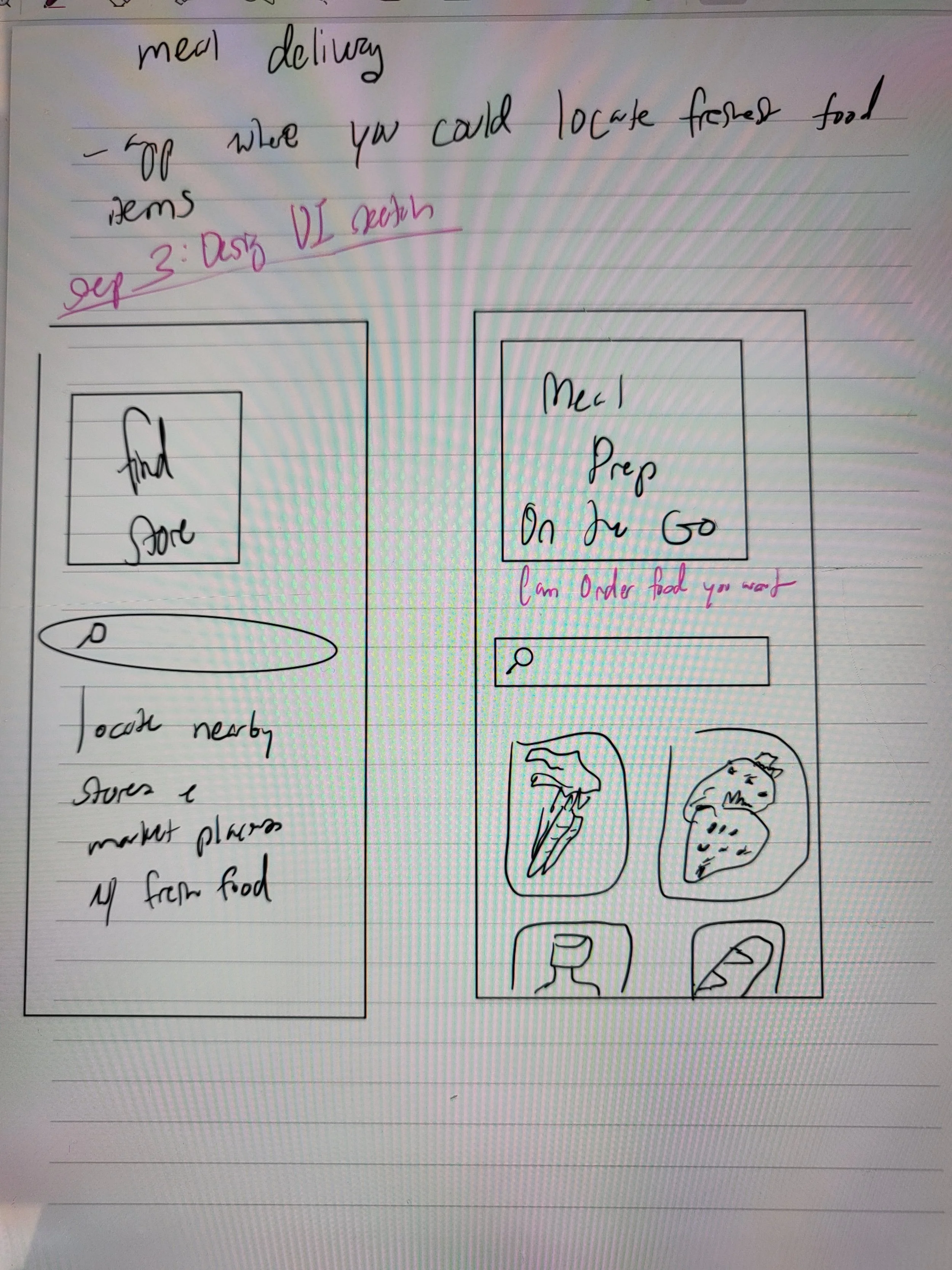
Original Sketches
Competitive Analysis/Inspiration
I researched and pulled inspiration from several apps with similar premises, but honed in specifically on Doordash and Instacart.
Why Doordash?
Doordash is the top food ordering app in use. Having been responsible for nearly two-thirds of all delivery orders in 2022
Easy user interface for navigation
Why Instacart?
Possessed ability to shop recipes
Curated specifically to grocery shopping
With the design and quality aspects that accrued from my search, it was time to start wireframes and prototyping
User Flow
Low/Medium Fidelity Exploration
I wanted the UI to be colorful and fun, thus the initial designs were a bit…much
User Testing
After developing my initial prototype in Figma, I conducted usability tests to get an in-depth understanding of how users interact with the new interface. I conducted 6 tests in total over with the existing users and one additional. I mapped out a user testing plan, designed several tasks in the prototype, observed users completing the tasks through screen sharing on zoom, and asked for feedback at the end. I received good and surprising reactions and also some areas of improvement which I later implemented into the final design. I really enjoyed talking to users, showing them the new design, and seeing their reactions. It motivates me to make productive and engaging design decisions that benefit my users.
50%
Are regular food delivery app users
Approx. half of the participants order food at least 3 times a month
Negative Feedback
Brighter text was harder to read.
100%
Completed tasks without guidance
Each user was user was able to complete tasks given to them within designated 5 minute window.
All users did so under 3 minutes
Top Takeaways
Positive Feedback
Easy navigation.
66%
Ran into errors while trying to complete task
Most common error was with navigation, went to “search” bar over “categories” when tasked with ordering apples
One user was confused about the meaning with the distance/ price buttons
Comparison Feedback
Easier to navigate and more straightforward than comparable apps.
Affinity Map
Based on findings from user interviews, I cultivated a user persona to help keep my decision making aligned with the user needs.
Bio :
Education: BA in Communications, currently getting Masters in Social Work
Job: Working
Location: Columbus, OH
Hobbies: hiking, pottery
Frustrations :
Juggling between between being a full time student and worker already has her bunt out. The little free time she’s granted she prefers to spend it unwinding and pursuing hobbies, thus leaving little time for proper meal planning.
Ambitions :
Amaya is dedicated to building a more structured lifestyle for herself, and curating better eating habits is a huge part of that
Pain Points :
Wants to do more grocery shopping, but feels too busy
feels that many food apps don't revolve around meal planning
Amaya, 25
Next Steps
1. Tone down busy UI and typography
2. Provide clarification on slight navigation confusion
3. Implement further informational details regarding recipes and items
4. Retest with users after finalizing prototype
Introducing Food Find
A mobile app designed to facilitate an easier and engaging way to meal prep and grocery shop. Users can obtain food items the standard way by browsing food categories, or choose to shop by recipes and customize ingredient amounts to fit their serving size needs.
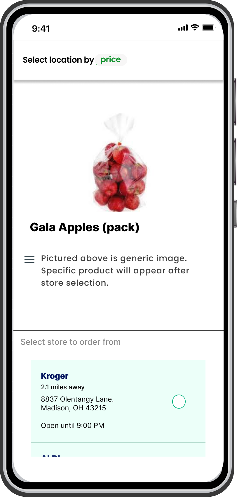
Product selection
Vertical scroll through store selections.
After selecting items, options between price and location are given to organize stores
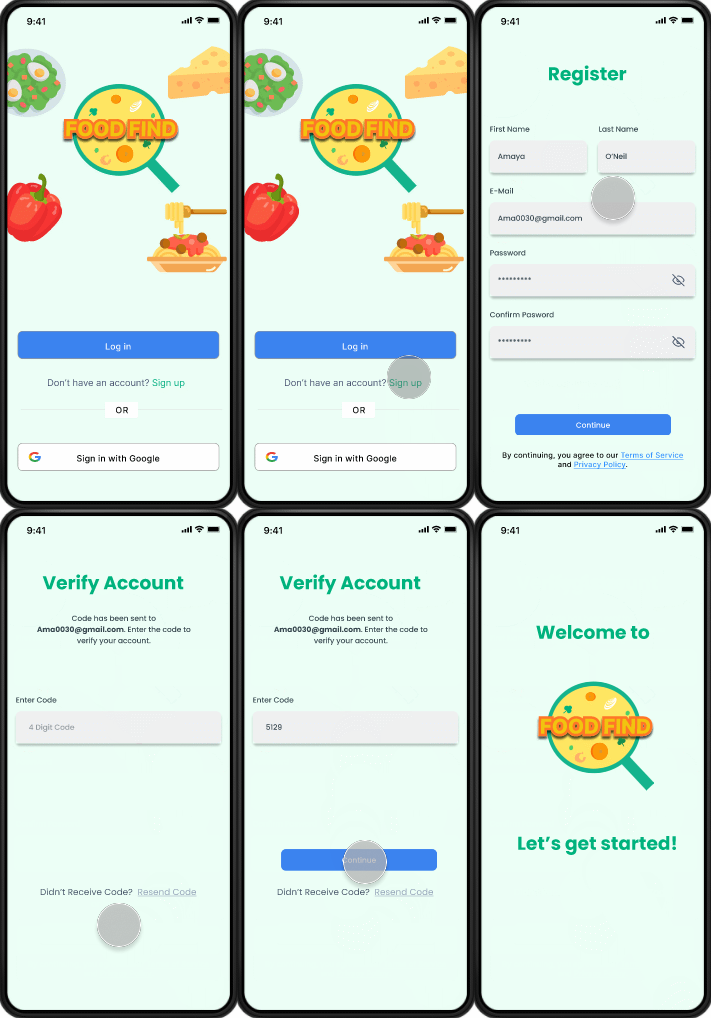
Easy onboarding
2 step process to create account
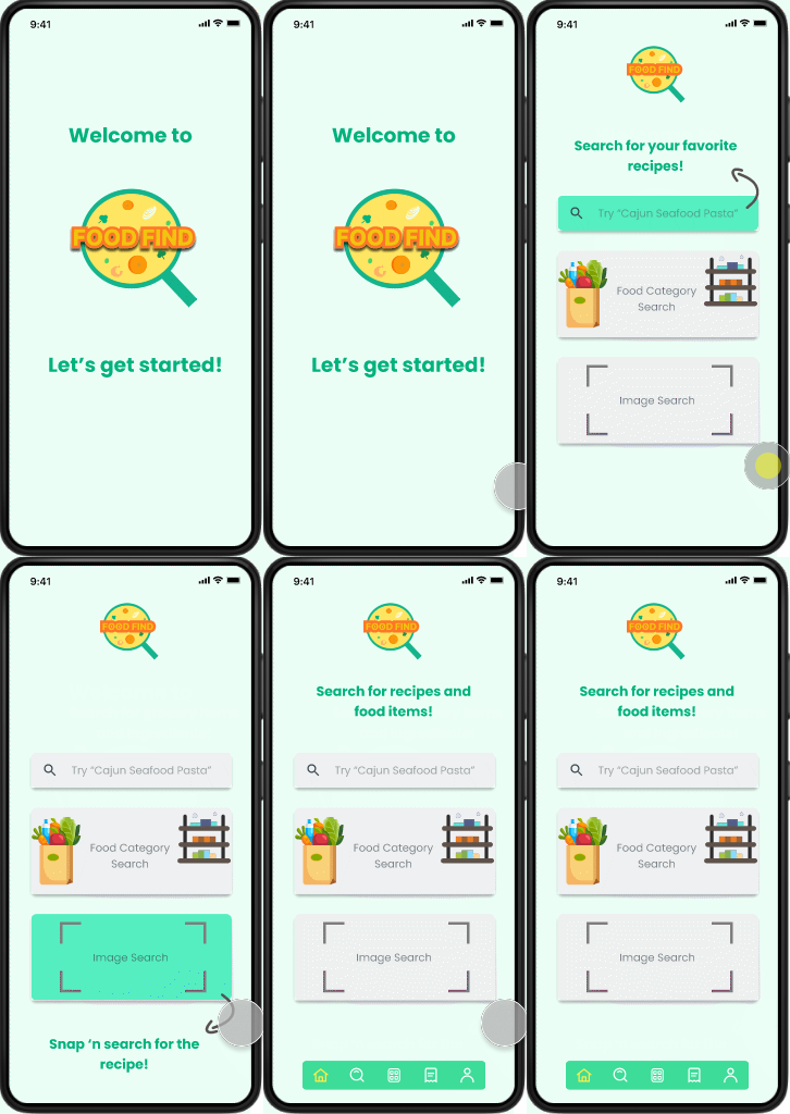
Clarifying steps on how to search items
Each box will be highlighted during initial onboarding and explain their functions
Sleeker, smoother iconography and typography
Can use search bar to find “aisle” or look up food and corresponding category will be highlighted.
Can vertically scroll through multiple “aisle” options
After store selection, product options of store will be availible to click through
Selected store will highlight green. Can still change store after selection.
Snap ‘n Search
Users can take a picture of their food and search engines will farm through data to match the image as best it can.
Users then have the option to be taken to the results page and sort through recipes.
Or if the Image Search Result isn’t what they were looking for they can choose to show more results.
Additional Screens
Mess around with final Prototype here!
You can click through all three in-app shopping methods: Image Search, Category Search, and the Search Bar.
Visual branding
I wanted to keep the design fun, youthful, and engaging. And after reevaluating my initial UI choices, I was able to land at a comfortable intersection of fun and professional.
Color Scheme
Navigation Bar
Logo
Iconography
I designed the logo in Figma
I wanted the logo to be a play on a magnifying glass and a cooking pot from the aerial view.
I also created the peas, sliced carrots, onion, and broccoli to emphasize that this is an app to help users put food together.
I chose bright and fun vector images to promote the positive atmosphere I was trying to convey when designing the app
100%
Of participants preferred the new UI to the old one.
Expressed that is was more “sleek”, “professional”, and “organized.”
Some suggestions of adding more pops of color in places to avoid “white void.”
75%
Found the introductory information on the Home page very helpful impacting their understanding.
Final User Testing
With the polished final prototype, I conducted 8 user interviews with the same metrics I had the first time around. The results were as followed:
Overall the feedback from my participants was overwhelmingly positive. Compared to the UI layout of version 1, the users unanimously preferred the look of version 2. But despite the positive perception of the design, there were a few bumps in the road with understanding semantics. Measured by scale, the users rated the difficulty of completion an average of 2.5/10, moments of confusion, albeit slight, appeared while buying Gala apples through the food aisles. Finding their way to the apple section was a breeze, but some thought that the “Select Bag” option was too similar to the “Add to Bag” button, and many suggested that a color contrast between selecting bags of apples vs individual apples would be helpful. Many also expressed similar feedback with the “Add to Bag” and “Ct” buttons while selecting which brand of Gala apples to buy. While those buttons weren’t the same color, it was still suggested to contrast them a bit more. Or even to change it to only allowing the “Ct” button to appear after item(s) are bagged, since some of them went to the “Ct” button first, confusing the green “Add to Bag” as a marker that their desired brand was already selected. Users reacted positively to the “Sneak Peak” feature and expressed how this type of feature sets the app apart from competitors. They also really enjoyed the vibrant vector art, just like in version 1, they expressed how the inclusion of cute art really helped drive home the fun and unique atmosphere of the app.
63%
Ran into errors while performing the given tasks.
No more than two errors occurred per user.
Frequent feedback in having more contrasting colors for “Add to bag’ and “Ct” buttons.
Final Takeaways
My first experience conducting a case study was both exhilarating and overwhelming. I didn’t expect how continuous my redrafting of the UI would be. Going through several iterations before landing on the one that stuck was a massive lesson in itself. But I also didn’t expect to be as surprised as I was by the user feedback. Realizing their true roadblocks and aspirations vs what I had initially theorized gave me a level of zeal that I hadn’t felt in a while. It ignited not only the designer in me, but also the problem-solver. I’m excited to continue to design accessible solutions and having my perspectives widened.


